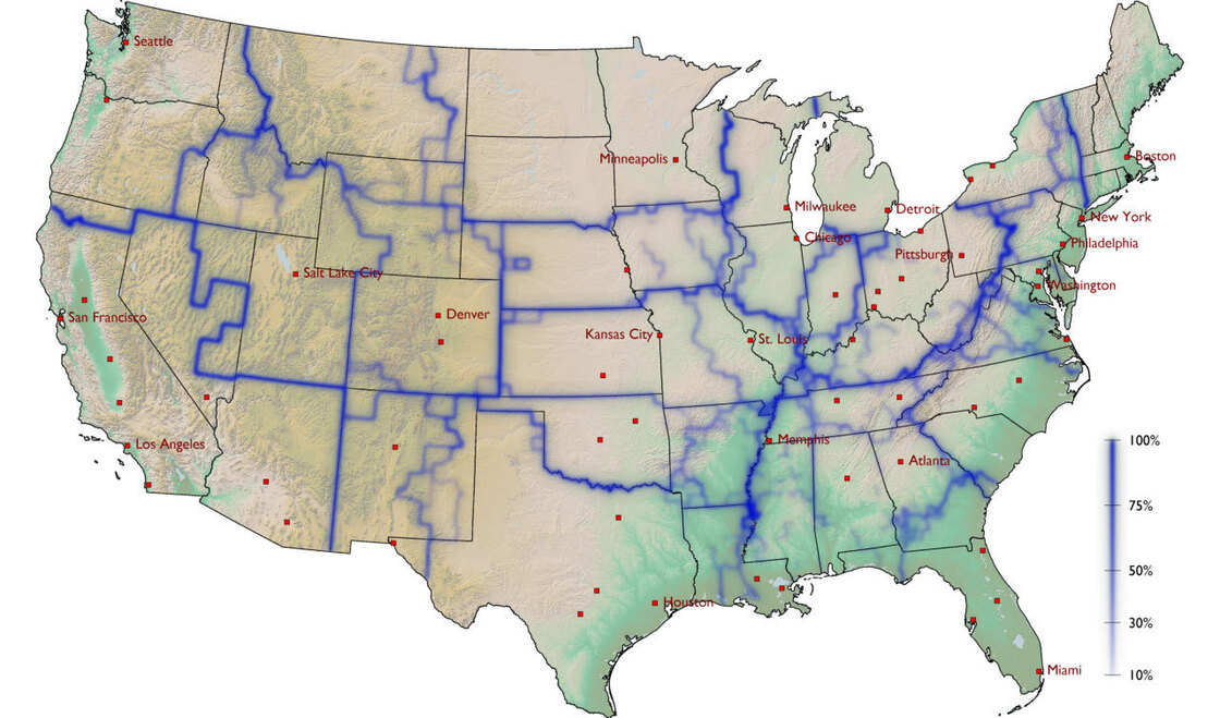
Look at the center of this map, at the little red dot that marks Kansas City. Technically, Kansas City is at the edge of Missouri, but here on this map it’s in the upper middle section of a bigger space with strong blue borders. We don’t have a name for this bigger space yet, but soon we will.

Dirk Brockmann/Northwestern University
I would call it, for the moment, “The Part Of America Kansas City Hangs With” because that’s what this map is saying. It’s a new, intriguing way to see our country. This one was built by tracking dollar bill circulation. There’ve been similar maps built from phone call data. The idea here is to show America not as 50 states, but as regions where people do stuff together. In other words, a “Whom Do You Hang With?” map.
How It Works
Here’s the notion. A few years ago, , a theoretical physicist from Germany, was visiting his American friend Dennis, and they got talking about population mobility. Dirk knew Americans move around a lot, but he wondered how to capture where they go, who they talk to. His friend said, “Have you ever heard of Dirk hadn’t.
It’s a website that tracks the movement of dollar bills. Thousands of people participate. All you do is take a bill out of your wallet, type the denomination, serial number, the date and your zip code onto the Where’s George? site, and then, with a pen or a stamp, deface the bill with the words “WheresGeorge.com.” After which (and this is key), you spend it. So now your bill is moving from business to business, person to person, and if and when another Where’s George volunteer discovers it, she or he will note where, note when and spend it again. Since dollar bills pass between people, Dennis suggested why not us the “Where’s George?” data to get a sense of where people go, and, just as interesting, where they don’t go?
That’s what Dirk did. After checking 1,033,095 reports (describing the movement of 464,670 bills), he came up with this map. In the Seattle area, for example, his team found that over two weeks, only 7.8 percent of the bills moved more than 500 miles away. Most of the money stayed close. More interestingly, Dirk’s team began to notice virtual borders, lines that the money rarely crossed. In this map, you can see the territory marked by the Canadian border to the north, a bit of California at the southern end, and Idaho to the east. Oregon and Washington seem undifferentiated. But at the edges, a blue border seems to capture and contain most of the cash (and the people?) moving within. Those lines, Dirk marked deep blue.

Dirk Brockmann/Northwestern University
Deep blue means “This is as far as most of the money goes.” In other places, the territories were less sharp, so Dirk made them less blue. Going back to Missouri, for a moment …

Dirk Brockmann/Northwestern University
Notice there’s a softer blue line running between Kansas City and St. Louis. That’s because each city pulls money to itself, creating an absence of movement (and therefore a border) between them, but when Dirk stepped back, the harder borders for this region stayed hard. In this part of the U.S., money sloshes around a territory marked by Missouri, Kansas, Oklahoma and Arkansas, with the Mississippi river forming a border on the eastern edge. This hunk of America, in his view, is now an “effective community,” a place where people-to-people business has a distinct flavor, distinct from neighboring regions. In other words, it’s its own neighborhood.
California’s “neighborhood” includes Arizona and much of Nevada.

Dirk Brockmann/Northwestern University
New York City, by the same logic, sits on top of a mega-region that runs all the way to Georgia (though there are soft borders around Washington, D.C.); Chicago captures a chunk of Indiana and Wisconsin, but not southern Michigan.

Dirk Brockmann/Northwestern University
Yakkety Yak, Yak Mapping
Money-in-motion is one proxy for how people connect. Yakking on the phone is another. Xiaoji Chen at MIT’s was able to get her hands on anonymous cellphone data from AT&T’s network. Her map, which she calls “,” reveals a set of similar telephone “neighborhoods.” As with the money map, Washington, bits of Oregon and Idaho “talk” together, but the big bloc of plains states doesn’t hold together: Missouri doesn’t yak that much with Oklahoma or Arkansas (but Okies and Arkies are tight!) Oklahoma doesn’t phone Texas that much — which I find curious …

MIT Senseable City – “The Connected States of America”
Nonetheless, Xiaoji Chen calls the territories on her map “emerging communities … defined by human networks.” I couldn’t tell from her website if most American phone calls are local (I assume they are, what with kids calling parents, parents calling kids, babysitters, family, friends and lovers).
She has a long distance map. It shows lots of hubs, but you can see virtual communities emerging here. Red, for example, codes for calls going to or ending in New York. Notice the pale fountains of red flying out of Florida and L.A. heading to Manhattan, and the tower of red, of course, at the source.

Courtesy of Xiaoji Chen
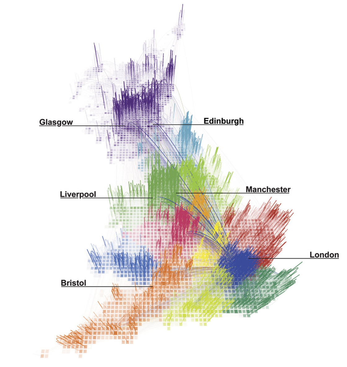
Other countries appear simpler. In this British map, done with Mauro Martino, the telephone “neighborhoods” are more obviously local. Britain looks like a crayon box of distinct city-sized clusters. Blue calls blue, purple calls purple. It looks almost like you’d expect.

Courtesy of Xioji Chen
America may be a little different. Scotland and England are old societies with habitations that go back a thousand years. Arizona and New Mexico are brand new boxes created by politicians around 100 years ago and plopped onto a map. It doesn’t surprise me that as human neighborhoods they barely register in these new maps. Or that California is cut in half (in the phone map). What Xiaoji Chen and Dirk Brockmann are suggesting is that real communities in America may be utterly different from the 50 state boxes we display on our political maps. We don’t look like we live. We sprawl across our borders, ignore state lines, live as we like.
These are the first maps that are trying to paint us the way we actually are.


