Local government here always seems to be about three generations behind in technology, and the state of city and county’s external digital faces in the form of their websites are a strong suggestion about how poorly technology is being applied internally. Here’s hoping that City of Memphis at least, after years of a mediocre website that does nothing to inspire public confidence or portray a big time, high-performing city government, will finally get the attention it deserves with the incoming administration of Mayor-elect Jim Strickland.
The World Wide Web turned 25 years old three months ago, and any organization that is serious about communicating, persuading, and informing is on it.
Of all those organizations, no sector does as poorly as government in creating efficient, effective websites. In other words, websites that respond to what users want to know rather than what the government officials want to tell.
Our local governments have always lagged behind in technology, so it’s no surprise that their websites are a long way from being among the better ones, and as a result, they are missed opportunities for transparency, for opening lines of communications with the public, and for providing applications that turn accountability from a talking point into a reality.
Today, the World Wide Web carries everything from ways to navigate cities, to communicate with friends, to find a date or a spouse, to find a movie to watch, and to plan almost every segment of our lives. It has transformed our lives and the expectations we have and relationships we want for the businesses, organizations, and government that we deal with.
Reflected Glory
It has been suggested that websites are a virtual reflection of the culture of the enterprise itself. If that’s the case, local government continues to primarily see its citizens as sources of revenue and someone to be talked at rather than taxpayers who would like to have more light shed on the programs, projects, and services and who would like to have a way to share their opinions and ideas.
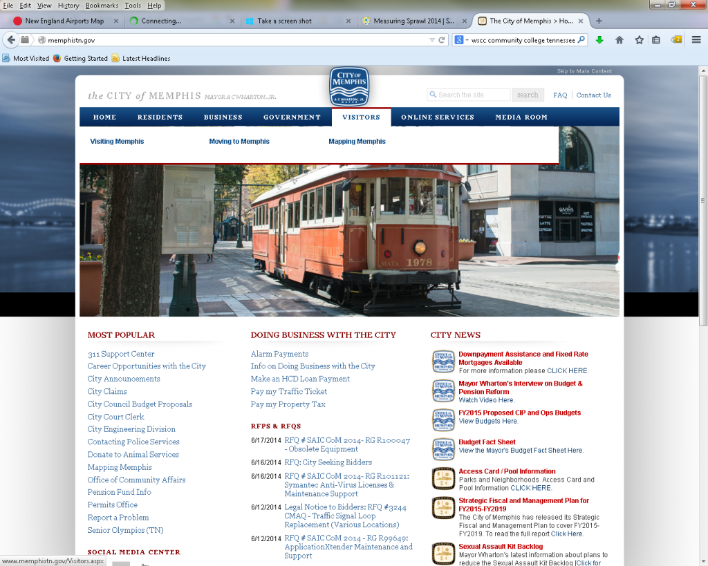
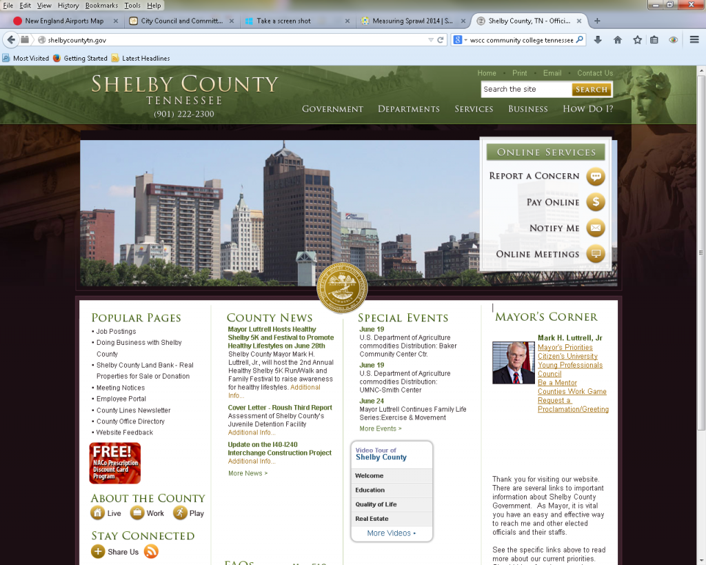
The City of Memphis’s website feels like it’s a largely outdated, difficult to navigate one that’s had a prettier face put on it. Meanwhile, Shelby County Government’s website is a cookie cutter design sold by the numerous web companies that sell one-size-fits-all templates to governments (who could do better if they convened a meeting of their own local web designers).
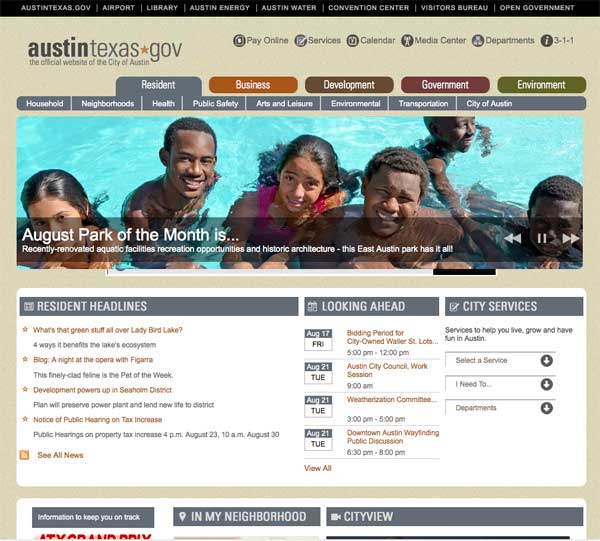
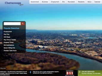
Two of our favorite city websites are Austin, Texas, which won the 2013 Best of the Web Award for cities, and Chattanooga, which captures the reinvented image of a city where extraordinarily high-speed Internet is available to every home and business in the city.
Austin’s old website languished for years, but finally, in 2011, Austin’s in-house Information Technology staff, with design input from the public, rebuilt the website using Drupal, an open source content management system that City of Memphis had the opportunity to embrace several years ago but soldiered on with more of the same.
Simplicity Counts
The Austin and Chattanooga websites both feature a prominent search field and the design is minimalist. Users don’t have to know the org chart for either government to find what they need – unlike both city and county governments here.
Austin offers a data center, which includes data, charts, and graphs and a listing of all city apps; it also provides an archive of thousands of its social media records, and it provides a Speak Up Austin page in which citizens can post ideas and read those from other people.
All in all, the websites offer what all of us are looking for: they are simple to understand and simple to use. Equally important, both governments are committed to keeping their websites fresh and timely. The Austin CIO said: “I don’t think we’ll ever rest again” as he pursues a website that is search-centric, data rich, and open source.
City officials encourage hack-a-thons to develop new apps and is planning to contribute ready-to-use Web modules back to the city’s open source community for their contributions. The City is also looking for more information from state government that can be added to the city website.
Think Users First
Alameda County, California, won the 2013 award for best county website. While we’re not fans of its design, it is interesting in that it relies on social media, podcasts, RSS feeds, and signups for newsletters. The county has also hosted two hackathons in recent months and some of those apps have been integrated into the website.
Alameda County also has an organizational chart for every county department and a forms center with an easy search function. Like the best government websites today, the emphasis is on citizen engagement, open data, mobile apps, and self-service.
It’s all part of a national shift in government websites that has not reached Memphis and Shelby County. In the past, government websites were driven by large technical vendors who build sophisticated back-ends but don’t consider the user experience or show sensitivity to what taxpayers want from their online governments.
The best websites these days consider the users first by identifying what they are looking for, and as a result, they are making significant changes to navigation. The least helpful websites, like those we have here, show few signs of life or updates. Most of all, they feel like they are about governments who want us to hear what they have to say rather than responding to what we want to know.
Old News Is No News
Meanwhile, the best websites offer 311 functions, and although Memphis has a 311 function on its website, but it is a long way from having an intuitive, easy-to-use application. That said, Shelby County doesn’t even measure up to that level.
Meanwhile, the “Living in Memphis” video on the city website features hotels whose brands have changed and buildings and companies that no longer exist. In the “Media Room,” the last post was December 13, 2012, and the “Memphis Highlight Reel” is from 2011. Click on crime statistics on the police department’s page and you get data for 2006. The Crime Mapper function on the same page doesn’t work.
Worst of all, the city and county websites routinely give no easy-to-understand, easy-to-use, easy-to-find information about the big issues being considered by either government. For example, information about the pension debate is buried in the home page’s “Most Popular” list as “Pension Fund Info,” and if you want to compare the dueling pension reports by PwC, the City of Memphis adviser, and Segal Consulting, the firm hired by City Council, you have to be really determined. The first is on the “Pension Fund” page and the latter is tucked away on the City Council’s page.
In the end, however, the biggest downfall of the city and county websites is that the taxpayers who paid for them are clearly not who the web masters had in mind when they developed them. If there’s a place to apply for a public board and commission, we can’t find it. As one web savvy friend of ours said: “Even when I know the information is there, I sometimes give up trying to find it.”
Post It All
That’s often because a visitor to the websites needs to know the government org chart to track down information. It’s a labyrinth. Few people know that to find information about senior citizen centers, they need to look under Parks and Neighborhoods; for youth services, look under Executive, and for City Beautiful, look under Public Works.
City of Memphis demonstrated its interest in transparency when Memphis Mayor A C Wharton signed an executive order about it, and Shelby County Mayor Mark Luttrell has voiced a similar commitment. That said, a big step toward transparency would be to pass a simple policy – they could do this with by memo – that requires every report, study, and plan of city and county governments to be posted online.
While we are working here to get the basics right, other local governments are using their websites to open up their governments, to engage the public, and to provide more and more information. Seattle has more than 120 open databases with information about city operations, including maps, forms, calendars, charts, filtered views, files, and documents. Taxpayers can track actual performance to departmental objectives and use a map-based locator to find services and map events in their neighborhoods.
More and more dashboards are being created to provide the public with real-time information about government services. Boston (whose website is poor) is the latest city with a dashboard, and there, Mayor Martin Walsh has two 46-inch screens in his office that show dashboards that display data about everything related to Boston – from the percentage of buses arriving on time to how many potholes have been filled. It’s a way for him to have a snapshot at any time of his government’s performance and to see how well services are being provided. Mayor Walsh’s screens also show an analysis of social media so he can feel the pulse of daily life in his city.
Rethinking Our Websites
Meanwhile, other cities are creating phone apps for all kinds of services, hosting video conferences and online town halls, opening up discussions about decisions to more than the usual suspects, and offering ways for the public to get creative by asking them for ideas for small scale projects like public art or broader scale projects such as alternative uses for city viaducts.
It is an exciting time in the technological advancement of government. It is the golden age of data.
Hopefully, city and county governments will come up with a plan for moving our community into the mainstream of innovative thinking about their websites and how they can be instrumental tools in meaningful communications with citizens.
PS: It’s not the official Milwaukee Police Department website, but the unofficial Milwaukee Police News is what a good website about police officers should look like.
Previously posted June 19, 2014
***
Join us at the Smart City Memphis Facebook page for daily articles, reports, and commentaries that are relevant to Memphis.


This is very true about our city and local government web sites. Some of the web pages look as if they were created 15 years ago when the web first became the dominant source for information.
Only last month did the Memphis airport finally update its web page to something more modern. Previously the airport’s web site was one of the worst anywhere. Even as its been refreshed it is still sad to see how small the airport has become with so few flights.
Web presence is a reflection of the city we live in today, but like most things in Memphis, we are very much behind other cities.
Great post.
It’s worth noting that web sites in Memphis change so infrequently because people in a position of power to change them stay in their positions until they retire.
The Airport finally updated their because a new CEO updated it – but the retiring CEO has no interest in doing so. Go along to get along.
Big dynamic cities no not have the same small good ole boy networks that never move, never get recruited elsewhere….consequently we never get new ideas, new people from bigger cities.
With this in mind I would expect the Memphis Convention and Visitors Bureau website may not get a makeover until someone retires. But rest assured after a nationwide search to replace him…we will hire a local.
Hi, this weekend is nice designed for me, because this occasion i am
reading this enormous informative article here at my house.