From Bonddad blog:
Some Ugly Economic Charts For Detroit
This is the one I found most interesting: the resident population of Wayne County where Detroit is located. Since 1970 the region has seen a steady decline. We see the first big drop occurring in the 1970s as the population dropped from a little under 2.7 million to about 2.25 million. There is slight attrition in the 1980s and 1990s where we see a decrease of about 300,000 (about 2.2 million to 1.9 million). It’s really the last 10 years that show the sharpest decline, as the total population fell from about 1.950 million to 1.8 million.
There is simply no way for a region to survive this kind of population attrition and still have a meaningful economic environment. Consider the above chart with this from the today’s NY Times:
Many retirees expressed a feeling of powerlessness, a sense that they stand to lose the benefits they worked a lifetime for because of things beyond their control. Motor City has lost more than a million residents over the last six decades. When it shrank its work force, it left fewer current workers to contribute to pension funds that still had to pay benefits that were earned by large numbers of older retirees who had served Detroit when it was a bigger city.
I also found this really interesting. The unemployment rate was low during the 1990s. However, during the first expansion of the 2000s unemployment was still high, fluctuating between 7.5% and 10%. We see a huge jump to 17.5% at the height of the last recession. Now the rate is 10% — which is about 2.5% higher than the national average.
Notice the drop in non-farm payrolls that occurred in the previous expansion: we see a drop from about 2.1 million to 1.7 million. Now we see a rebound to about half of the previous level. Just as importantly, that pace of creation as been flat for about the last year.
During the early 2000s when the economy was expanding, Detroit lost over 150,000 manufacturing jobs. That’s a mammoth number. And the rebound has been tiny compared to the fall.
As a result of the huge population outflow and drop in overall jobs, we see a major drop in housing starts. Remember — housing starts are a big component of most economic expansions, meaning this drop is very important.
These charts only tell part of the story. But they are still fascinating to consider


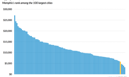
Here’s the definition of Memphis’ problem. If we don’t change this we cannot afford the glamor projects our politicians favor.
http://247wallst.com/special-report/2013/07/23/ten-cities-where-the-poor-cant-get-rich/3/
I recently visited the semi-finished Beale Street Landing. How could we possibly have gotten so little for so much money?