This is the latest installment of our occasional feature, Urban Indifference, which focuses on problems that are pock marks on our urban environment.
There are a number of cities across the country that are fighting the big boxes.
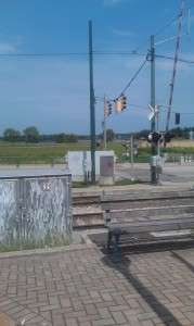
Of course, in those cities, it’s about big box retail. Here, we’d be happy if we could just do something about our apparent obsession with boxes everywhere – boxes to hold the mechanicals for traffic lights, boxes to hold electrical access, and now a box on top of Beale Street Landing.
It’s yet another sign of our lack of emphasis on good urban design and a reminder of our continued pursuit of a city known for its cheap choices rather than its investments in quality. Given the choice between putting the contents of these boxes underground or make them more unobtrusive, we always go for cheap.
All of this is also a reminder of the warning about allowing engineers to determine a city’s quality of life.
Every day, people walk down Union Avenue from the Peabody Hotel to the riverfront. They are greeted at the foot of Union by a collection of ugly boxes that detract and obscure the spectacular view of our biggest attraction, the Mississippi River.
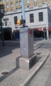
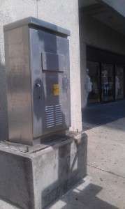
Oddly, we are apparently so proud of these ugly silver boxes that we often put them on pedestal so they are even more impossible to ignore.
Here are two typical ones on corners near the Peabody Hotel.
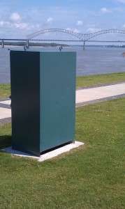
Then there are the big boxes in some of Memphis’ most popular places – like Tom Lee Park.
But perhaps the most incredulous box of all is the one for the elevator on top of the sloping green roof of Beale Street Landing. We’ve been long-time, vocal supporters of the project but it’s hard to make a case that the box is anything but an incongruous aberration atop the first major investment in a riverfront attraction since Mud Island opened 30 years ago.
Speaking of questionable design decisions, we hope that before Beale Street Landing is opened, the gates to the parking lot at Tom Lee Park will get a do over. They looked like a school shop class project from the beginning, but these days, sitting in its present condition next to Beale Street Landing, they say volumes about how little concern we have about the tears in our urban fabric.

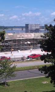
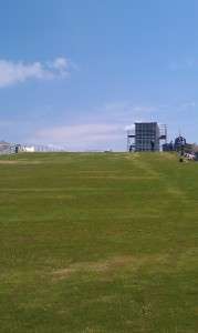
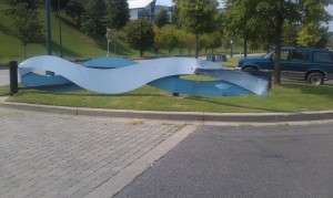


We should have another design competition for the BSL box. Top ideas for how to disguise and/or celebrate an elevator tower.
Mine are:
Chicken coup? Southern living has a neat story about backyard chickens this month. We could make the box look like a giant chicken house. The Metal Museum could build us a couple giant decorative hens to grace the roof lawn next to it.
Rubik’s cube?
Fake Apple Store with another giant glass cube surrounding the unexpected box protruding through the lawn?
We could move the MEMPHIS sign from the concrete plant being torn down to the roof of the box to make it look even BIGGER?
Playground slides? Lighthouse beacon? Cover it in moss?
A simple solution could be to plant ivy at the base of the box and just allow it to cover it naturally. Just an idea.
Or… We could surround it with a giant chicken wire form of Godzilla and THEN let the ivy cover that.
If we are going to be a dysfunctional gaudy mess, let’s celebrate it! Have some fun at our own expense. Maybe it is time to say, we are who we are. Chicken wire ivy covered Godzilla.
How about a giant murderous catfish like the giant crabs from one of those 1950 horror movies where they grow from radiation?
Or be trendy with a zombie version of Elvis?
Thank God someone is concerned with design in Memphis. These examples demonstrate the blatant disregard for design, details, and maintenance, problems that trip us up repeatedly. These problems devalue Memphis.
Tom, how do we raise the standards? Maybe you’ll have to start a Bad Design Does Memphis (In) FB page.
Carol brings up the real story… Maintenance. I have my opinion of design. Others may be different. The one epic fail every single Memphis project in history seems to have in common is lack of a reliable sustainable maintenance plan. I propose that we adopt an ordinance with legislative teeth that mandates dedicated funding for upkeep before we approve any new public construction. Nothing new until we fix what we have and plan to take care of what we build.
The Tom Lee gates, to me, aren’t a terrible looking design. They are just falling apart and non-standard items aren’t cheap to maintain. Who asked 10 or 15 years ago who and how they’d be repaired when nature takes it’s course? (just a convenient example, not intended to open an rdc worm can)
Leave it to SCM to create the perfect classic visual. Terror from the deep crawling up BSL.
Wish I were nearly as smart as you and the other posters above. I have no solution, but like the design competition idea. There is a lot of taken in Memphis.
I actually like the idea of a wire sculpture covered with ivy or hedge. Don’t know what shape to depict, but a green sculpture hiding the elevator shaft and blending with the grass might work if done expertly. Giant catfish with proper details might look interesting. Whatever, the box must go. Where does the elevator go anyway?
Fantastic post. As delight as I am whenever a new project is announced in Memphis my next thought is that it will be – most likely – poorly designed. It’s not just utility boxes of course – it’s nearly every construction project in Memphis. Thanks, SCM for bringing up design as an important element in creating a vibrant, creative urban landscape.
I must agree with Ms. Coletta that a Bad Design Memphis FB page is in order. Seriously, those of us who care about Memphis design need a place to not only call out poor design but to rally against it.
I would also think pressure needs to be applied to specific long standing blight i.e. the empty half built Horizon Condo project is certifiable blight.
I agree per the elevator housing atop the Beale Street Landing. In my wildest dreams I imagine the glass elevator used to carry patrons down to the Apple Store on Fifth Ave. in Manhattan atop the landing instead of the box that is there now.
From what I can find, it appears as though this was not a last minute add-on but was always to be a part of the landing despite the fact that a rendering or two failed to include it. Of course, the design has changed significantly since its inception (including the mammoth parking lot in Tom Lee which took the place of the underground parking structure) as more and more pressure has been applied to cut costs. In the end, the quality of a product is usually dependent on the investment made to create it.