From The Black Urbanist:
Floating through airports over the summer, I have noticed how remarkably similar they are. I would think an international building with the ability to showcase the local culture would in fact be that showcase. Instead, I’m seeing the same generic architecture. I feel that the airport, as the million (and lately billion) dollar showpiece of your town , should be unique in not only architecture, but in the content that it sells and displays.
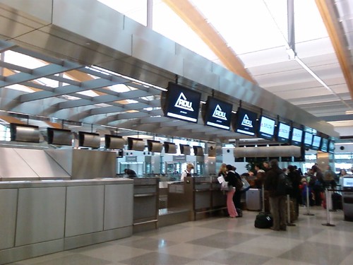
When I arrived at Raleigh-Durham International Airport on the way to the CNU 19 in Madison, WI, my first response was a series of oohs and ahhs. The arches, the glass elevators, the pre-security Starbucks and sandwich shop, the big windows, I was amazed. Then I started thinking, somehow this all looks very familiar. The baggage claim with the ticketing floor terrace was Baltimore. Same with the security tables between the restaurants. The arches I’ve seen in Detroit, Indianapolis, Charlotte. Everybody has windows. Even in Madison, without the arches, there were windows, beige and the feel of the constricted and shed-like RDU Terminal 1. Great, I’m thinking now, we have always had an airport plan that’s bland and adds nothing to the character. Yes, the art is different and cool, but when did big arches come to symbolize air travel?
Yes, this looks cool, but I think I’ve seen this airport before…(Image Credit Flickr user: Evil Jess
At this point you can go ahead and ask why I should care? It’s just the airport. You come in and you go out and you are only there as long as it takes to get on a plane. However, we all know you can spend a minimum of two hours preparing to get on a plane, 30 minutes getting into flight, the time of the flight, then about 30-45 minutes to exit. This of course assumes that there is no layover. If that’s the case, you are stuck in a building with processed food, stale air, overpriced wi-fi and horribly uncomfortable chairs. You might be able to pay to access an airline lounge, but it’s not worth the expense.
So what do I think airport authorities should encourage out of their architects? What kind of experience do I want in the airport?
First of all, I like the Tampa model for architecture. Tampa’s main building has a nice mid-century modern, golden age of passenger air travel feel in their main terminal. Once you go upstairs, you are then invited into the 21st century, through people movers that take you to one of five spoked terminals, each of which reflects a different tone and character. There are still windows so you can see the planes, but it doesn’t all look the same. Also we could add chairs at the gate that don’t have the bars, in case people do in fact need to sleep at the airport.
For what’s sold in the airport, the airport needs to reflect Austin’s model, with a ban on chain restaurants. RDU is about half and half. Still, my true home airport of Greensboro only has one restaurant and I assume it’s locally owned, but even it may be controlled by that airport franchising company . Same with the stores. Outside of a few duty-free and magazine shops, having a store like the Motown store in Detroit is excellent for establishing the meaning of a place.
One last amenity that should be offered is a family wing. Similar to the USO lounge for soldiers and families, maybe around Christmas and other major holidays, one of the airline lounges can become a family area, so that families can calm their children down and keep them from being loud on planes or tired young professionals can catch a few hours of sleep on the way home from visiting parents.
But I digress, what do you think your home airport should have or look like? How can we make our airports better places?


What I believe the airport is missing is the same level of creativity that the Mayor has shown around the arts /bikes. Repeatedly, stories appear in the CA telling us that connecting travelers (that’s the passenger life blood of the airport not local traffic) prefer to connect through a different hub – yes they AVOID Memphis International. Yes, the airport is dated, small and feels confining but the smallness is also strength if the airport played up ease of connections through marketing in the region. Traffic continues to shrink, the bond ratings were downgraded and the airport relies on passenger landing fees but it refuses to sell / market its product to the traveling public.
A few things other airports / airlines are doing to remain completive and creative that we should look at –
Below is a recent WSJ item on airports that are opening premium lounges that are available to anyone willing to pay a fee. The Raleigh airport opened a lounge themselves – now that’s creative out of the box thinking.
http://online.wsj.com/article/SB10001424052702303406104576443872185838488.html?KEYWORDS=the+middle+seat
http://www.rdu.com/shoprest/services/clubatrdu.htm
Atlanta in partnership with Delta is opening a kid’s space in the airport for unaccompanied minor travelers with video games, computers and supervision.
http://www.theairlinezone.com/2011/07/delta-sky-zone-an-improved-travel-experience-for-your-kids/
We could enhance the airport experience for military members and their families by opening a USO center in the airport – many many other airports have partnered with this non-profit to provide a space in the airport specifically for military travelers and their families. Fred Smith is a huge supporter of the military and our veterans and might be willing to fund such a space at the airport.
http://www.uso.org/Centers/Inside-a-USO-Center/Inside-a-USO-Center.aspx
Appointing a creative committee to look at ways to improve our cities number one economic engine seems like a good idea. Utilizing the creative class to foster a dialog about low cost ways of making Memphis International a more completive, passenger centric connecting airport could pay dividends.
One last note our airport is dark – the carpets , the walls, the ceiling, all are dark in color making a small space feel even smaller – bring in some experts that can help us make the space feel less dated via color –